BrainAhead is a fun curriculum and science-based learning tool designed to maximize academic achievement and improve mental health in students. The program guides kindergarten to grade 5 students through a compilation of brain-activating videos, exercises, and activities.
Context
I got involved at an early stage of brand development at the end of 2018 when the company was called Brain 1st Program. You can see the first phase of the brand here. In mid-2020, the name changed to BrainAhead. As their product has evolved to meet the changing needs of their customers, the brand has also grown, so we did a brand refresh. The first steps were to create a new logo, brand guide, colour palette and typography system for the new website.
Problem & Objective
BrainAhead was a new concept, so getting people to understand its significance and potentially massive benefits for their students was challenging. It takes a lot of science-based information to get districts and schools on board. The brand must be educative, comprehensive, and engaging for students and educators. The objective was to show BrainAhead as an essential part of learning.
DESIGN RATIONALE
Their previous brand felt generic and needed to align with their company vision. I collaborated with the founder to redefine their brand identity and create a distinctive logo. In the redesigned concept, the letters "R" and "H" formed a path reminiscent of a neurotransmitter, with an extended "H" symbolizing growth.
Poppins was selected as BrainAhead's primary typeface for its modern, sans-serif style emphasizing legibility and balance. This typeface, characterized by geometric circles, became an essential element of BrainAhead's brand identity. We established scale rules to ensure consistent typography, including font weights, space tracking, and leading.
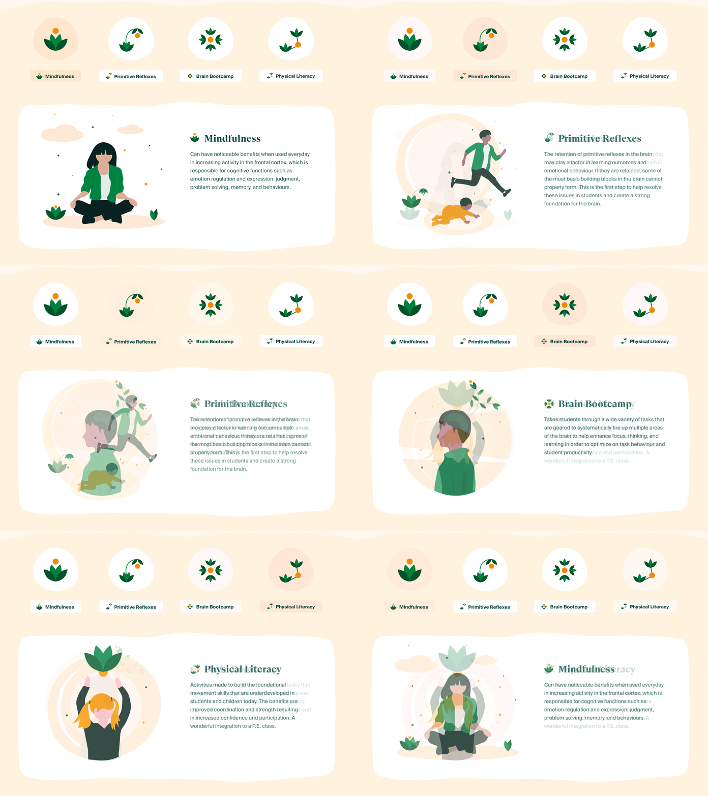
We retained the previous colour palette with some enhancements to maintain consistency with future website updates. Infographics were crucial in conveying the new concept and making BrainAhead's foundations easier to understand.
Skills
UI/UX Design • Branding • Illustrations • Visual Identity • Mobile app • Web Design • Landing Page • Figma • Photoshop • Illustrator
Founder & Director: Cally Bailey and Laura Dieleman
CEO and Head of Marketing: Rondi Shouse
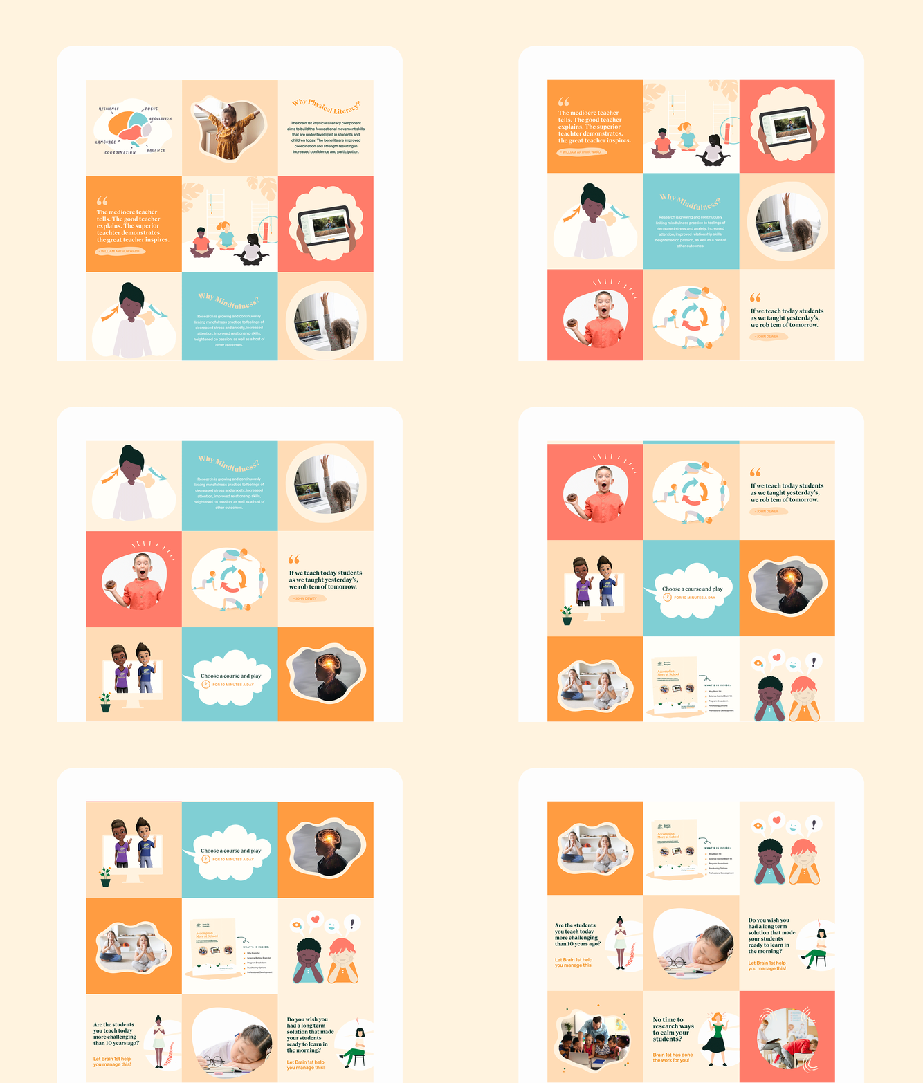
Social Media Content: Harleen Gill & Haley Estrada
